How often do you click on a roadside billboard? Never — it’s impossible. The advertisement is placed there simply for awareness. It’s a special value that is sometimes ignored when we transfer to digital marketing. Click-through-rates are great and quantifiable — a plus in the science field. But in reality, their volume alone should not be the defining KPI of your campaign. Instead, there are two perspectives to consider for the magic formula: For the marketer, a successful banner ad is measured by whether or not it generated high quality leads, and for the majority of viewers, a successful ad is measured by the emotional impact it leaves.
How do you make an impact then, in a small rectangular space, amidst the trillions of display ads that occupy the Net? To break through the white noise, science companies must rethink and reenergize their creative campaigns. Everything that is great about your company, brand, product and vision should be communicated in a memorable way.
Now happens to be the perfect time to act: Adobe Flash rich media ads are being phased out by publications and blocked by browsers such as Google Chrome (accounting for just over 50% of all desktop users), as Google seeks to improve its users’ experience. New banner ads will be programmed using HTML5, allowing science marketers to enhance their creative vision in a much more sophisticated way.
Despite the upheaval, the goal for HTML5 banner ads remains the same as your other digital assets. For your long-term success, we’ve compiled a tactical toolbox with insights from diverse industries. Use these evergreen best practices to make your B2B or B2C banner ads count.
1. Design for your audience.
For any science company, an understanding of the target audience is key. If you’re trying to attract an experienced researcher, your ad should be targeted towards their specific needs, rather than those of a recent college graduate. Building a banner ad with your key demographic in mind will help increase engagement, thereby increasing the likelihood of converting viewers to customers. Related to this, ensure your landing page follows through with the same language and design; it’s a must-have for user-experience.
2. Engage your viewer.
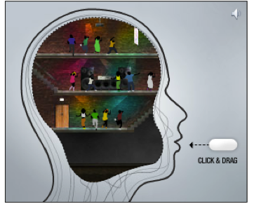
Roll out the red carpet and invite your viewers to actively participate in the advertisement. This rich media approach replaces static banner ads with video, audio and other creative techniques to actively engage the viewer. From a simple drag and drop animation like the example below; or via gamification, as with this clever problem-solving ad from Volkswagen, rich media banners drive results and improve reader retention.
3. Add a dose of animation, sparingly.
When it comes to animation, there’s also a fine line between compelling and overwhelming. We’ve all seen banner ads that are so excessively animated they make our head spin, driving the viewer to avoid the content all together. An impactful way to use animation might be as simple as rotating the text displayed within the ad to share additional information, without crowding and scattering the customer’s attention. This is a great tactic when an ad needs to convey more technical information.
4. Be contemporary.
Using a relevant pop culture reference, news or trend is a great way to capture a reader’s attention. When used correctly, memes can be a fun tool to break up a monotonous day in the lab. The one caveat: you must actively avoid any references that could be offensive or controversial.
5. Insert humor.
Who doesn’t love a good laugh? Inserting humor into your banner ad is a great way to attract and retain your viewer’s attention. If you are going to go this route, make sure you err on the side of witty and clever, rather than dirty and cheap.
 6. Let your image do the talking.
Sometimes less truly is more. If your company has strong name or product recognition, consider developing a simple banner ad showcasing the results of the product and image of the product itself. The creative example shown here is simple, funny and demonstrates the strength of the bug spray chemical. Enough said.
7. Ask the question.
Engage your viewers with deep, targeted questions, prompting them to reflect on their status quo. Are your reagents letting you down? 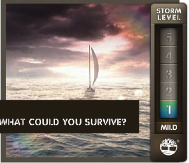 What does pure water mean to you? By evaluating their current situation, the viewer will transition towards a more open, malleable mindset – improving the odds that they’ll investigate deeper. To seal the deal, remember to include a call-to-action. Banner viewers will be linking to your website in no time.
8. Experiment with new tools.
Introducing the latest digital technologies shows you’re a progressive and innovative company. Unsure where to start? Talk to established publications about the software tools they enable. Some popular examples include SnapApp, a software platform dedicated to the production of interactive ads— from animated infographics to calculators to quizzes. Meanwhile, Scratch-It promotes its team as “the leaders in reveal marketing”, where viewers are able to uncover a hidden message by actively participating with the ad. These new technologies can take established display marketing tactics to an entirely new level.
As we move into a new era of banner ad graphics and programming, hold on to the classic principles of how to engage an audience. Humor will never become obsolete. Viewers will always gravitate towards the image that resonates with their lives. And remember that call-to-action — its goal should be to produce high quality leads. Above all, work to make a lasting impact on the wider audience. There’s no advantage in being a wallflower.
See all of C&EN’s digital advertising solutions, with case studies, glossaries, and more.
