
The power of visual content is undeniable: It’s easy for audiences to digest, connect to on an emotional level, and leaves a lasting impression. This makes photographs, videos, infographics and other visuals powerful marketing tools for reaching your target audiences.
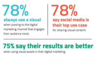
And according to a report by Contently, 75% of surveyed brands say they get better results from marketing campaigns that use visual assets, compared to those that don’t.
As marketers in data-driven industries like the chemical sciences, we can often get trapped into thinking about traditional, written forms of scientific communication like scientific manuscripts or posters. In doing so, we may use jargon-full, coded language that could be fatiguing, even for our highly-technical audience. We also limit the potential amplification of our content by making it inaccessible to a broader audience.
Fortunately, scientific fields lend themselves well to some pretty incredible visuals. Even scientific journals and authors are putting more effort into making visual content and figures that enhance understanding.
Let’s take a look at some examples of the compelling visual content that brings technical details of the science world to life.
Stunning Imagery and Original Photography
As the saying goes, “a picture is worth a thousand words.” Both complex and simple images can communicate far beyond the technical language used to describe them, with the added benefit of connecting with your audience on a deeper level.
Take, for instance, the first-ever direct image of a black hole, voted by Nature to be the top science image of 2019. The visual itself is incredible and was shared far and wide across social media and news channels. What got even more attention, however, was the photo of lead scientist on the project, Katie Bouman, and her reaction to seeing the image for the first time.
It captured the excitement and elation that comes with ground-breaking scientific discovery, emotions that experts and non-experts alike can relate to. It’s also a rare look into the discovery process, something that broader audiences typically don’t get such a candid look at, and brings in a personal, human touch to the science.
For many scientific brands, this is an important lesson: Science can and should be personalized to connect with audiences on a deeper, human level. Sincere imagery and photography of real scientists can do just that.
Compelling Data Visualization
With the explosion of fields that generate massive amounts of “big data,” like genomics, there is a growing need for ways to make sense of huge data sets, finding the patterns within. Enter data visualization, which uses charts, graphs, and other elements, to extract and communicate valuable insights from data. These can be visually appealing and, much like photography, they support the efficient communication of complex information to a broad audience.
Climatologist Ed Hawkins accomplished this with a simple visualization of Earth’s increasing temperature. The image went viral on social media and has since been printed on shirts, cars, yoga pants, and even buildings, bringing attention to an issue that has long suffered from “apocalypse fatigue.”
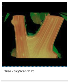
Many analytical techniques, like X-ray micro-tomography, produce images that are downright stunning and don’t require any visualization techniques to be applied.
Just check out this gallery of images produced using Bruker instruments. These images are attention-grabbing, impressive, and much more compelling than a list of an instrument’s technical specifications.
SciArt and Infographics
Science is often positioned on the opposite side of the intellectual spectrum as art. But creative endeavors, like the #SciArt movement, have blended the two to create some amazing visuals, including beautiful illustrations of coronavirus, watercolors and paintings of gel electrophoresis banding patterns, and crocheted neurons. Many infographics, which focus on the aesthetic arrangement of images with minimal text, fall under this category and are effective marketing tools for the simplistic, visual stories they tell.
This infographic from Abbott is a great example, explaining the different types of diagnostic tests for SARS-CoV-2 and where they fit in the infection cycle. Here at C&EN, our Chemistry in Pictures series showcases the aesthetic beauty of chemistry in our audience’s day-to-day. The images are typically submitted by our audience, and is often sponsored by brands, through social media competitions or highlighting products’ uses in the lab.
Short and Long-Form Video
These days, everyone’s carrying high-quality cameras in their pocket, making it easy to generate video content with the push of a button. This medium has a lot of benefits for attracting qualified visitors through organic and social channels, driving high conversion rates.
Zymo Research commonly uses video on their social channels to give a glimpse behind the scenes in their manufacturing facilities or show how reagents and equipment are being used out in the field. Video can also be used to create hilarious science content or visually stunning content that explains complex scientific concepts and research findings.
While videos can be expensive to produce, many brands report seeing better engagement with authentic, less produced videos. For example, videos from the Khan Academy and TikTok are incredibly effective at capturing attention and teaching complex concepts. So, think about ways you can utilize the platforms your audience is already using and accustomed to, like Instagram, to both deliver in formats that are more engaging – and save on costs.
Visual Content Distribution Channels
So, what does this mean for your marketing strategy?
If you’re not already, think about how visual content can be infused into your other marketing channels. Compelling imagery, original photography, and infographics can be featured in your written content including, blogs, sponsored content, and campaign landing pages. Videos can improve your organic visibility when used throughout your website and can also tap into traffic through other search engines, like YouTube.
The Importance of Visual Content in Social Media
It’s worth noting that many of the most impactful examples above went viral through social media. Hootsuite reports that LinkedIn posts, Facebook posts, and tweets with images get much more engagement. The same holds true for video content.
If you aren’t incorporating visual content into your social media strategy, one easy place to get started is through repurposing existing content. Is there a key figure from one of your white papers that you could spruce up or simplify for use in your next post? Another option is getting in touch with co-workers who are more visually minded or your scientific teams to see if they have any ideas for visual content that your audience might find appealing.
Live events are another place that visual content and social media intersect. With many trade shows and gatherings cancelled for the rest of the year, think about how virtual events can be leveraged for visual content. It can be as simple as taking a candid screenshot during a Zoom meeting, such as this one from the instrument services and support team at Thermo Fisher Scientific.
With the current technology we have, capable of capturing images and videos, there are many possibilities for generating visual content. No matter where or how you decide to source and use your visual content, never lose sight of the wants, needs and preferred channels of your target audience and your brand. This may take some internal training and audience research to perfect, but the pay-off will be a more personal, engaged following of potential customers.


