Here at C&EN we just debuted the first major redesign of our website, cen.acs.org, in several years. We started the technical process over a year ago with a massive back-end architecture revamp, and then started on the new front-end experience for our users and advertisers.
 This was all following a complete redesign of the C&EN print magazine, a new platform for C&EN’s digital edition, and the launch of our custom content studio, C&EN BrandLab – among other changes!
We have put the reader at the center of our decision-making at each stage of the process and did extensive user testing to ensure we were getting it right. The new cen.acs.org is fresh, modern, mobile first, and easy to use.
The organization of breaking news and features stories on the site is also completely different: Rather than driven by how the print magazine is organized, as it’s been in the past, the website is now structured around topics such as energy, education, and sustainability. When people search for information on cen.acs.org, they’re not using the terms “editorial”, “features,” or “concentrates”, and instead are trying to find the news around catalysis, green chemistry, or drug discovery. The site’s navigation now matches readers’ behaviors and allows for better targeting for advertisers as well.
Saying that, we know how important the print magazine is to our readers and advertisers alike. None of C&EN’s platforms is meant to exist in silos, and we’ve worked hard to keep each experience fresh, but connected. As an example, we will continue to aggregate the content from each specific print issue in one location so that even on the web, you can access the curated list of weekly must-read articles and enjoy a structured reading experience.
We paid a lot of attention to making C&EN articles a delight to read. We hope you’ll notice the increased incorporation of video, photos, and artwork, which is intended to create a more visually rich and valuable reading experience. We have also made social-sharing tools more discoverable to make it easier to share our most compelling reads with friends and colleagues.
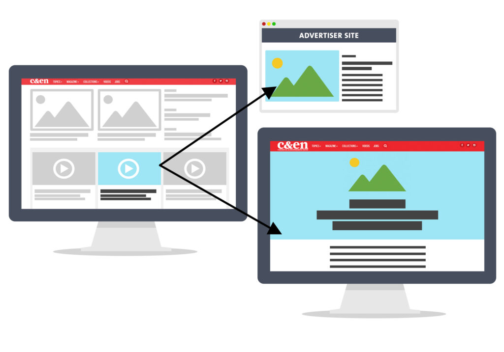
Advertising on the site is also more integrated and beautiful. In particular, we have made native content from the C&EN BrandLab studio more attractive, interactive, and easier to find, showcasing your brand while keeping our labeling consistent with FTC regulations. Here’s one example of how advertiser content now appears:
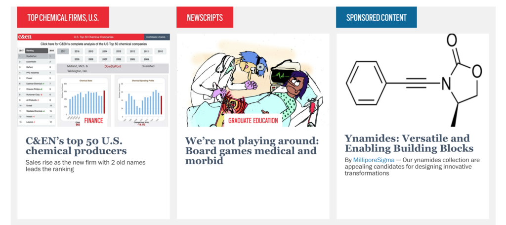
We’ve also introduced new ad units as well: Native display, true native, and native video ad units. Native display units promote your content with imagery and compelling headlines to a landing page on your own site. You don’t have to be a C&EN BrandLab partner to utilize this feature, although true native ads are interspersed throughout the site to promote C&EN BrandLab stories. Finally, we also now have native video, built within the editorial feed to serve high-quality click-to-play video content, again in a non-interruptive way that’s best for you and our readers. You can read more about how to utilize this new feature in our marketing team’s blog post. We’ve already seen impressive click through rates, well above industry standards, and are excited to see the types of campaigns our advertisers will create.
We’ll be making additional improvements and exciting changes in the days and weeks ahead, including rolling out a more powerful search engine, collections of our Periodic Graphics visuals and most popular features, and new ways for our readers to personalize their C&EN experience. Until next time!

Bibiana Campos Seijo
@BibianaCampos
