
Color is all around us. It stimulates us, it inspires us, – and it convinces us. Whether you realize it or not, color has a big impact on your brain and decision-making. So with the average attention span declining, it’s imperative as marketers to capture the reader at first sight, and effectively utilize the role color can play in our scientific-focused ads.
In a print ad, we know that there are many aspects to get right. An effective ad has short, concise text presented in an esthetically pleasing way to bring the reader to your product or company. With text in hand, the reader is focused – there are no flashing web ads or links to other areas of interest. You want the scientist to realize the message being conveyed is worth this attention. The reader can then stop and analyze the content, think about it, and rip the page out. The ad is tangible and has made the reader think about the next step, maybe even sharing the ad with a colleague. What drives them to these actions?
We debate this question endlessly in production. How often have we heard the phrase, “I want this to ‘pop’ more”? Should the text be bold, italic, or should the color be changed? How will the reader be hooked? With the witty tagline? The thought-provoking image? The product details? What if there was one element above all others that could impact the reader the most?
Is ROYGBIV – the sequence of hues that make up the rainbow, – the ultimate marketer?
Colors can evoke certain emotions, which can reinforce information provided in an ad. While some will critique the idea that you can assign feelings to colors, sighting a lack of true research in this regard, it is still widely understood that “there are broader messaging patterns to be found in color perceptions… they play a fairly substantial role in purchasing and branding.” Further, this article cites research that has found up to 90% of snap judgments about products can be based on color alone.
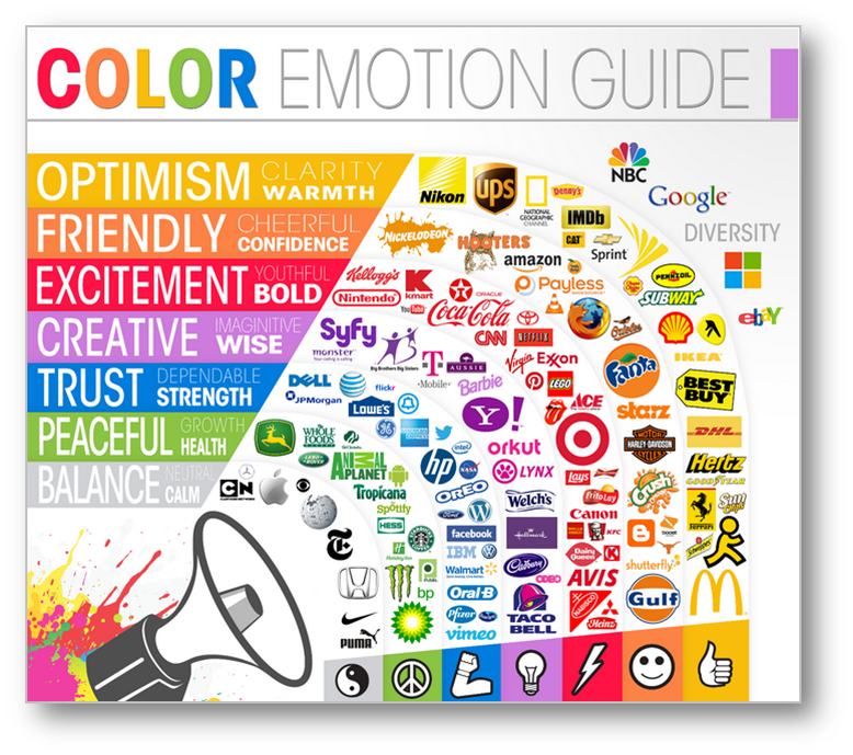
Granted, there are probably not many scientific products that are purchased on a whim! However, the article goes on to mention that “predicting consumer reaction to color appropriateness in relation to the product is far more important than the individual color itself.” What does this mean? Be sure to align the color in your ad to your audience. Just because green is the color of money and may convey prosperity, a scientific audience may actually react to it because it’s also associated with health and wellness. (Which is why hospitals and alternative medicines tend to utilize green hues.) If you’re choosing the color for the meaning you want it to have, versus how your audience will take it, you run the risk of losing your reader’s attention.
Rethink Your Color Palette
Often times, a marketer’s focus on color falls into one of two categories: it’s either a color that compliments the logo(s) in the ad, or it’s centered around a product image or artwork. But don’t be afraid to dive further in to the ad. For example, say there is one word in your tagline, and it’s red. It should be red for a reason, not just because it looks good, but also because it strikes a chord. Colors make us feel something. Whether the emotion is happy, sad, excited, inspired, – or even up for debate – the bottom line is: color makes an impact.
Finally, forget text – as science marketers, we often have to use more complicated imagery. But you don’t have to understand why a scientist might choose a combination of colors to present their findings in a graph or image. It can still be worth tweaking these colors so they look good in a new context, – your ad or application note, – and to keep readers from getting lost among the other scientific findings. You now have the choice to infuse the artwork with optimism, creativity, trust, or balance. And with this color change, you are on a better path to convince the reader that your product is worth their time and effort.
What are your favorite uses of color in print advertising? Let us know in the comments below.


