The infographic is a powerful tool for reaching large audiences in an engaging way. But the 21st-century human wasn’t the first to figure this out. The evolution of the modern infographic can be traced back through time from current figures such as Edward Tufte, the graphic design theorist, to Harry Beck, Florence Nightingale, and William Playfair. If you were so inclined, you could continue tracking the use of images as a way of communicating important information back to the hieroglyphics of ancient Egypt.
When you consider how long the ideas behind the infographic have been around, it gives you some insight into just how powerful this method of communication really is. Done correctly, it can convey a complex message in a minimum amount of space and, for science marketers, influence the thoughts and decisions of your target audience through multiple parts of the brain—something that words and pictures by themselves often can’t do.
So how can we use infographics to tell a scientific story? Let’s find out.
What Is an Infographic?
Put simply, an infographic is a visual representation of information in a graphic format designed to make the data easily understandable at a glance.
But the true impact of this communication medium transcends that rather basic definition by several orders of magnitude. This is because the infographic combines both data and images into a powerful representation of what might otherwise be just a boring list of facts.
As simple as that might sound, an effective infographic is about more than just writing a few facts and putting some pictures beside them. A good infographic involves presenting the right data, designing the right graphics, and much more. It can go a long way towards clarifying your brand and your message, and can motivate your target audience to put your company at the top of their mind. Done incorrectly, an infographic can be confusing and can make your brand and message unclear. Here’s how to do it right.
How to Craft Your Message
What Is the Goal?
In the excitement of producing an infographic, it can be easy to forget what the overall goal is. Are you there to persuade your audience to take action? Are you there to simply educate them on the topic your company knows most about?
Establishing your goals from the get-go will help you to produce the infographic in a way that satisfies your needs and most importantly, the needs of your target audience.
So, Who Is the Audience?
This is an important question to ask because it can inform everything from the layout to the data to the pictures. A scientific audience will have more knowledge about the subject than a general audience, so more complex data or images should be considered. This is especially true if you decide to use an infographic format in an ad in a niche publication.
When you identify your audience, you also identify how much they know about a topic, what’s valuable to them, and what questions they might have. This, then, influences how deep into the story you can go and what content and data to include. Just remember that “going deep” doesn’t mean piling on more information—simple is often better, especially if your design capabilities are limited. Identifying your target audience allows you to get to the relevant facts sooner without having to establish background information that other audiences might lack.
What Is the Message?
The best infographics tell a story and if that story is absent, your infographic will fall flat. A great example of this is NASA’s depiction of the Curiosity rover’s landing on Mars in August of 2012.
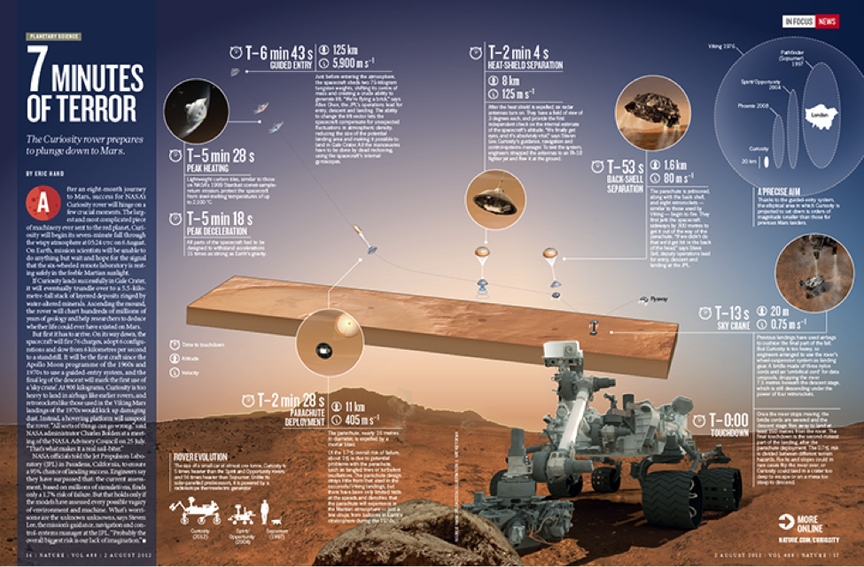
As you see exemplified in this infographic, it’s better to find data that tells a story, explains an interesting trend, or illustrates a meaningful pattern. Identify your message first, and the process of producing your infographic will be much easier, resulting in a more effective finished product.
Design the Right Graphics
The right graphics are more than just pretty images. They need to convey the information in both an engaging and effective way, often packing as much information as possible into a relatively small space. Remember the old adage, “A picture is worth a thousand words”? Nowhere is that more true than in the infographic.
As such, telling your scientific story in an infographic may require more than just cutting and pasting images from the internet. It will likely require new, professionally-produced graphics that convey complex concepts in a simple and straightforward manner.
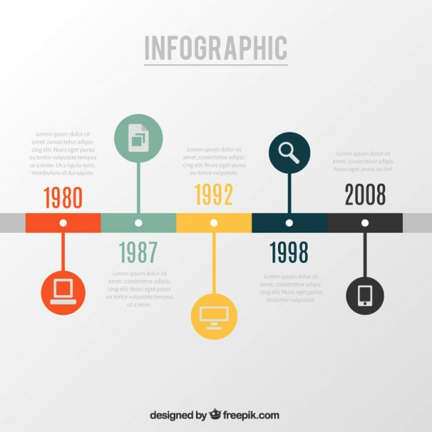
Additionally, you want to be sure you use the right format for the data you’re presenting. Should some of the data be represented by a timeline?
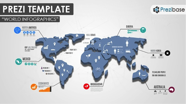
Would it look better with a map?
A simple chart could be the most effective, and you likely have some already if you’ve created application notes or PowerPoints.
Don’t be afraid to try new things, but make sure you use the right graphics for the data and story being presented.
Include the Right Facts
With data, it’s more effective to pick the most important facts than to inundate your audience with too much information. When those important facts are coupled with the right graphics, they’ll tell a more accurate story than a long list of data ever could.
How do you decide what those ‘right facts’ are? Go back to your goals for creating the infographic in the first place. Is your infographic going in an email to help make a sale? Who is your audience? Is it a bench chemist who would use your product in the lab, where reliability of her instruments affects her research? Or is it a purchase manager? A comparison of your benchtop freeze dryer versus your competitor’s would be a good tactic to utilize for the decision maker, but would fall flat for the researcher who is looking for actual lab tips.
Make It a Team Effort
Communication between those on the graphics side (artists) and those on the data side (often scientists or marketers) is important to the process of producing an effective infographic. This communication can help clarify any confusing pieces where the data may have been misinterpreted or the graphics could be altered to better reflects the facts. If you’re working in the same office, it may be something as simple as a short meeting. If the parties involved are working remotely, online tools like Slack or Scribblar can make the process much easier.
How Should You Tell the Story?
This goes back to the goals you’ve set. If you’re there to educate, you want to make the content as easy to understand as possible. You also want to make it appealing to the eye so that it draws the viewer in and keeps them involved.
If you’re there to persuade, it’s imperative that you stimulate the emotions in order to elicit a change in behavior or an action of some sort. Sometimes you can combine both into one infographic, but remember that how you tell the story is directly related to the goals you’ve set. Make the story fit your purpose.
The Final Product
When you combine your goal, target audience, and message with the right graphics and text, the infographic you produce will be engaging and informative, and communicate your brand or message in a way that exceeds the sum of its smaller parts.
That’s the beauty of the infographic and the reason it has become so popular of late: done correctly, it is an effective way of getting viewers involved with your brand. From a marketing perspective, that can have a significant effect on your target audience and drive your message deeper into their conscious (and subconscious) than mere words ever could.
