Guest blogger Ananya Palivela is a science writer with a passion for scientific communication. She specializes in translating intricate scientific concepts into compelling communication strategies. Her work empowers researchers and organizations to connect with their audiences in meaningful ways.
Science marketers have many challenges, but one of the most common is making complex topics engaging and easy to understand. One of the best tools for accomplishing this is graphic design, which can help turn heavy subject matter into content that clicks.
From creating scroll-stopping ads to helping the audience understand your product, design is a powerful and versatile aspect for every type of marketer. “People always misinterpret design as something that only looks pretty,” said Kenneth Phan, Senior Creative & Brand Manager at ACS. “To me, design is a communication tool.”

It’s kind of like a Venn diagram. The beauty is when all the elements align. How does it read? What mood am I creating? Who is it for? And how does it fit within my brand? And when you find that sweet spot, that is good design.”
– Kenneth Phan, Senior Creative & Brand Manager at ACS
Luckily, you don’t need to be trained as a designer to apply design principles. Here are five tips for elevating your visual communication.
1. Understand Your Target Audience
The first thing any marketer needs to remember is to always focus on your audience. Different people get excited about different things. Figure out who your audience is and what they are interested in, and then tailor your content to fit their knowledge and interests.
For example, if you were marketing for a university, you should use different imagery for recruiting undergraduates versus hiring professors. Tailoring the design of your ads to your audience can create more personalized and impactful marketing campaigns.
Here is an ad by GE promoting women in STEM. It shows American Physicist Millie Dresselhaus, also known as the Queen of Carbon, being treated by the media as a celebrity, like a Hollywood actress or singer. This is fantastic targeting since it resonates with Women in STEM and encourages young girls to consider a career in science.
2. Follow a Visual Hierarchy
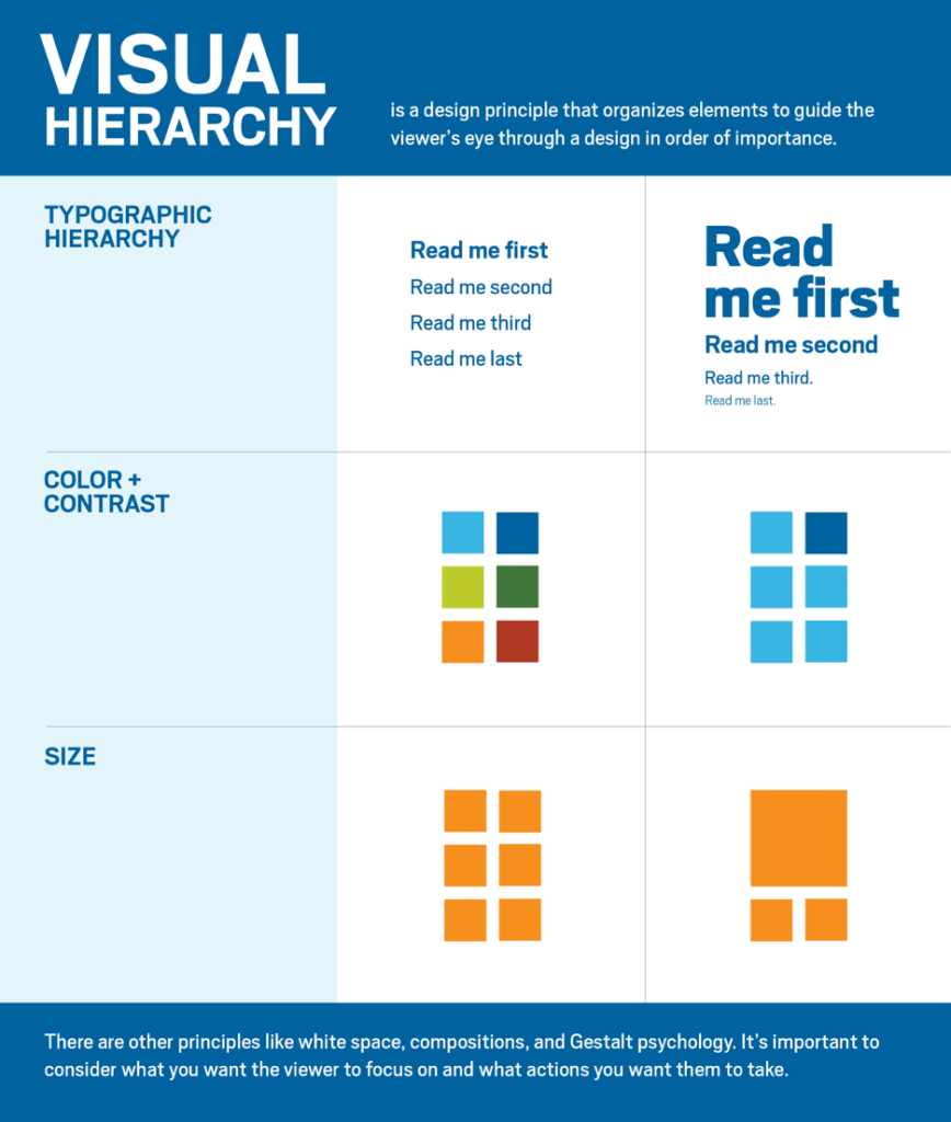
“When you write a story, you have a headline and some subheads, and then you have paragraphs,” said Phan. “The same thing goes into design as well. You have a visual hierarchy. You have the power to direct people’s eyes.”
Visual hierarchy is one of the most essential principles in design. Whether it’s a complex infographic or a simple LinkedIn ad, carefully structuring the elements to lead the audience through the content in the correct sequence is essential. People always start by looking at what is large and bold. If everything is the same size, then they read it left to right and top to bottom, as one would read a book.

Assets like ads or social content that lack a clear visual hierarchy can struggle to grab attention due to the lack of focus. This is where visual hierarchy plays a crucial role, guiding the audience through the relevant information and eventually towards the ‘call to action’.
3. Use White Space (also known as Negative Space)
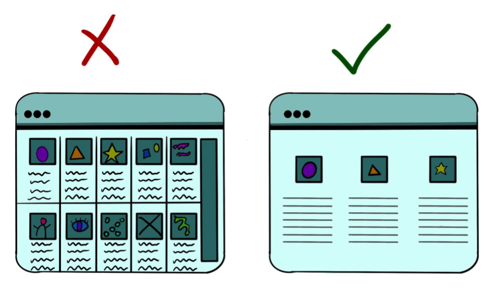
One of the most effective tools for guiding visual hierarchy is white space, also known as negative space. This is space that is intentionally left empty between visual elements. While this may seem wasteful to the untrained eye, it significantly boosts readability and comprehension. It also serves as a guide, directing the reader’s focus to the essential information.
White space is crucial in dense scientific content. Diagrams or brochures crammed with information are challenging to read or understand. White space breaks up text, reduces cognitive load, enhances comprehension, and improves retention. It also creates a clean and professional aesthetic, which is helpful for any business or organization.

Assets like ads or social content that lack a clear visual hierarchy can struggle to grab attention due to the lack of focus. This is where visual hierarchy plays a crucial role, guiding the audience through the relevant information and eventually towards the ‘call to action’.
Scientists sometime think that more information and data is always better, or simply struggle to distill down their ideas into a digestible format. However, this often leads to work that is weak or confusing. “A lot of times what I see in science marketing is that marketers add too much information. This overwhelms people and makes them lose interest,” said Phan. “Often, the goal in marketing is to attract users to take an action to learn more and engage with your brand and the science, not to explain a complex subject.”
Infographics, charts, and graphs effectively present statistics, making the content informative and easy to comprehend. You could also make the infographic interactive to boost audience engagement, like this example for W.R. Grace, created in partnership with C&EN BrandLab. Readers can click on some parts of the infographic to get more information. The layout is clear and easy to understand.
4. Showcase Your Brand
“When you do marketing, you always want to amplify the brand,” said Phan. “Establishing a design identity that uses a color palette and visual elements that emphasize your brand’s identity and maintain overall consistency is key.” Consistency helps create a recognizable and cohesive look, making your brand more memorable, which will ultimately impact the effectiveness of your marketing. Using a style guide to stay consistent with your brand helps keep you on track.

Here’s an example of NASA’s logo, which follows clear guidelines. Even if you remove “NASA” from the logo, what’s left behind is instantly recognizable as part of NASA’s logo.
5. Make Your Designs Accessible
Whether you are communicating your academic research or promoting your company’s latest product, you want your message to be available to as many people as possible. However, billions of people have impaired vision, which can range from mild reading troubles to blindness. You may be unintentionally excluding people from understanding your content due to poor choice of color or font.
Maximizing accessibility not only makes good business sense, but it is also the right thing to do! Here are a few ways improve your designs:
- Pick a font that is clear. “Fancy” fonts are fun but are hard to read for people with dyslexia or vision impairments. Use a font size that will be easy to read given the size of the final asset.
- Ensure there is good contrast between your writing and your background. Don’t use combinations like yellow text on a white background or black on grey.
- Avoid using only color to convey essential information — individuals with colorblindness will struggle to follow. Try including textures or labels as well.
For more recommendations for accessible design, review the ACS Inclusivity Style Guide.
Final Thoughts: Design for Science Marketers
Connecting design and content is the key to maximizing the impact of your marketing. “It’s kind of like a Venn diagram,” said Phan. “The beauty is when all the elements align. How does it read? What mood am I creating? Who is it for? And how does it fit within my brand? And when you find that sweet spot, that is good design.”
Are you looking for help sharing your message with an expert audience? The team at C&EN BrandLab are experts in science, storytelling, and design. We offer eBooks, interactive infographics, and other custom content. Contact us for a consultation today.

 Subscribe